

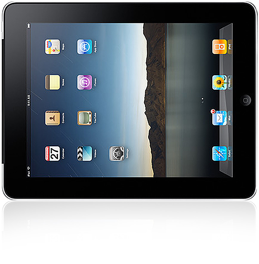
With Below code we can easily create beautiful and stylish Walker which is based on Pure CSS3
Create CSS folder and add below code in master.cssPure CSS3 Walker Pure CSS3 Walker
/*CSS ANIMATION
======================*/
a {
 padding: 3px;
 -webkit-transition-property: color,background-color;
 -webkit-transition-duration: 500ms,500ms;
}
a:hover {
 background-color: #c70909;
 color: #fff;
}
@-webkit-keyframes rotate-skull {0% {
 -webkit-transform: rotate(0deg)
}
25% {
 -webkit-transform: rotate(15deg)
}
50% {
 -webkit-transform: rotate(-5deg)
}
55% {
 -webkit-transform: rotate(0deg)
}
75% {
 -webkit-transform: rotate(-10deg)
}
100% {
 -webkit-transform: rotate(0deg)
}

}
@-webkit-keyframes rotate-head {0% {
 -webkit-transform: rotate(0deg) translate(0px,0px);
}
40% {
 -webkit-transform: rotate(10deg) translate(15px,5px);
}
80% {
 -webkit-transform: rotate(-5deg) translate(8px,5px);
}
100% {
 -webkit-transform: rotate(0deg) translate(0px,0px);
}

}
@-webkit-keyframes rotate-shell {0% {
 -webkit-transform: rotate(0deg);
}
20% {
 -webkit-transform: rotate(3deg);
}
40% {
 -webkit-transform: rotate(0deg);
}
50% {
 -webkit-transform: rotate(0deg);
}
70% {
 -webkit-transform: rotate(-3deg);
}
90% {
 -webkit-transform: rotate(0deg);
}
100% {
 -webkit-transform: rotate(0deg);
}

}
@-webkit-keyframes rotate-hip-a {0% {
 -webkit-transform: translate(0px,0px);
}
75% {
 -webkit-transform: translate(0px,0px);
}
80% {
 -webkit-transform: translate(5px,0px);
}
85% {
 -webkit-transform: translate(5px,5px);
}
90% {
 -webkit-transform: translate(-5px,5px);
}
95% {
 -webkit-transform: translate(-5px,0px);
}
100% {
 -webkit-transform: translate(0px,0px);
}

}
@-webkit-keyframes rotate-hip-b {0% {
 -webkit-transform: translate(0px,0px);
}
55% {
 -webkit-transform: translate(0px,0px);
}
60% {
 -webkit-transform: translate(5px,0px);
}
65% {
 -webkit-transform: translate(5px,5px);
}
70% {
 -webkit-transform: translate(-5px,5px);
}
75% {
 -webkit-transform: translate(-5px,0px);
}
80% {
 -webkit-transform: translate(0px,0px);
}
100% {
 -webkit-transform: translate(0px,0px);
}

}
@-webkit-keyframes rotate-hip-c {0% {
 -webkit-transform: translate(0px,0px);
}
25% {
 -webkit-transform: translate(0px,0px);
}
30% {
 -webkit-transform: translate(5px,0px);
}
35% {
 -webkit-transform: translate(5px,5px);
}
40% {
 -webkit-transform: translate(-5px,5px);
}
45% {
 -webkit-transform: translate(-5px,0px);
}
50% {
 -webkit-transform: translate(0px,0px);
}
100% {
 -webkit-transform: translate(0px,0px);
}

}
@-webkit-keyframes rotate-hip-d {0% {
 -webkit-transform: translate(0px,0px);
}
05% {
 -webkit-transform: translate(5px,0px);
}
10% {
 -webkit-transform: translate(5px,5px);
}
15% {
 -webkit-transform: translate(-5px,5px);
}
20% {
 -webkit-transform: translate(-5px,0px);
}
25% {
 -webkit-transform: translate(0px,0px);
}
100% {
 -webkit-transform: translate(0px,0px);
}

}
@-webkit-keyframes thigh-a {0% {
 -webkit-transform: rotate(0deg);
}
70% {
 -webkit-transform: rotate(0deg);
}
80% {
 -webkit-transform: rotate(-13deg);
}
100% {
 -webkit-transform: rotate(0deg);
}

}
@-webkit-keyframes thigh-b {0% {
 -webkit-transform: rotate(0deg);
}
50% {
 -webkit-transform: rotate(0deg);
}
60% {
 -webkit-transform: rotate(-13deg);
}
80% {
 -webkit-transform: rotate(0deg);
}
100% {
 -webkit-transform: rotate(0deg);
}

}
@-webkit-keyframes thigh-c {0% {
 -webkit-transform: rotate(0deg);
}
20% {
 -webkit-transform: rotate(0deg);
}
30% {
 -webkit-transform: rotate(-13deg);
}
50% {
 -webkit-transform: rotate(0deg);
}
100% {
 -webkit-transform: rotate(0deg);
}

}
@-webkit-keyframes thigh-d {0% {
 -webkit-transform: rotate(0deg);
}
10% {
 -webkit-transform: rotate(-13deg);
}
30% {
 -webkit-transform: rotate(0deg);
}
100% {
 -webkit-transform: rotate(0deg);
}

}
@-webkit-keyframes shin-a {0% {
 -webkit-transform: rotate(0deg);
}
70% {
 -webkit-transform: rotate(0deg);
}
80% {
 -webkit-transform: rotate(23deg);
}
100% {
 -webkit-transform: rotate(0deg);
}

}
@-webkit-keyframes shin-b {0% {
 -webkit-transform: rotate(0deg);
}
50% {
 -webkit-transform: rotate(0deg);
}
60% {
 -webkit-transform: rotate(23deg);
}
80% {
 -webkit-transform: rotate(0deg);
}
100% {
 -webkit-transform: rotate(0deg);
}

}
@-webkit-keyframes shin-c {0% {
 -webkit-transform: rotate(0deg);
}
20% {
 -webkit-transform: rotate(0deg);
}
30% {
 -webkit-transform: rotate(23deg);
}
50% {
 -webkit-transform: rotate(0deg);
}
100% {
 -webkit-transform: rotate(0deg);
}

}
@-webkit-keyframes shin-d {0% {
 -webkit-transform: rotate(0deg);
}
10% {
 -webkit-transform: rotate(23deg);
}
30% {
 -webkit-transform: rotate(0deg);
}
100% {
 -webkit-transform: rotate(0deg);
}

}
@-webkit-keyframes foot-a {0% {
 -webkit-transform: rotate(0deg);
}
70% {
 -webkit-transform: rotate(0deg);
}
80% {
 -webkit-transform: rotate(-20deg);
}
100% {
 -webkit-transform: rotate(0deg);
}

}
@-webkit-keyframes foot-b {0% {
 -webkit-transform: rotate(0deg);
}
50% {
 -webkit-transform: rotate(0deg);
}
60% {
 -webkit-transform: rotate(-20deg);
}
80% {
 -webkit-transform: rotate(0deg);
}
100% {
 -webkit-transform: rotate(0deg);
}

}
@-webkit-keyframes foot-c {0% {
 -webkit-transform: rotate(0deg);
}
20% {
 -webkit-transform: rotate(0deg);
}
30% {
 -webkit-transform: rotate(-20deg);
}
50% {
 -webkit-transform: rotate(0deg);
}
100% {
 -webkit-transform: rotate(0deg);
}

}
@-webkit-keyframes foot-d {0% {
 -webkit-transform: rotate(0deg);
}
10% {
 -webkit-transform: rotate(-20deg);
}
30% {
 -webkit-transform: rotate(0deg);
}
100% {
 -webkit-transform: rotate(0deg);
}

}
@-webkit-keyframes screen {0% {
 background-position: left bottom;
}
100% {
 background-position: right bottom;
}

}
#atat #shell {
 -webkit-animation-name: rotate-shell;
 -webkit-animation-duration: 4s;
 -webkit-animation-iteration-count: infinite;
}
#atat #skull {
 -webkit-animation-name: rotate-skull;
 -webkit-animation-duration: 7 s;
 -webkit-animation-iteration-count: infinite;
 -webkit-transform-origin: 0 50%;
}
#atat #head {
 -webkit-animation-name: rotate-head;
 -webkit-animation-duration: 7s;
 -webkit-animation-iteration-count: infinite;
 -webkit-transform-origin: 0 50%;
}
#atat #leg-a {
 -webkit-animation-name: rotate-hip-a;
 -webkit-animation-duration: 7s;
 -webkit-animation-iteration-count: infinite;
 -webkit-transform-origin: 100% 100%;
}
#atat #leg-b {
 -webkit-animation-name: rotate-hip-b;
 -webkit-animation-duration: 8s;
 -webkit-animation-iteration-count: infinite;
 -webkit-transform-origin: 100% 100%;
}
#atat #leg-c {
 -webkit-animation-name: rotate-hip-c;
 -webkit-animation-duration: 7s;
 -webkit-animation-iteration-count: infinite;
 -webkit-transform-origin: 100% 100%;
}
#atat #leg-d {
 -webkit-animation-name: rotate-hip-d;
 -webkit-animation-duration: 7s;
 -webkit-animation-iteration-count: infinite;
 -webkit-transform-origin: 100% 100%;
}
#atat #leg-a .leg-thigh {
 -webkit-animation-name: thigh-a;
 -webkit-animation-duration: 7s;
 -webkit-animation-iteration-count: infinite;
 -webkit-transform-origin: 50% 0;
}
#atat #leg-b .leg-thigh {
 -webkit-animation-name: thigh-b;
 -webkit-animation-duration: 7s;
 -webkit-animation-iteration-count: infinite;
 -webkit-transform-origin: 50% 0;
}
#atat #leg-c .leg-thigh {
 -webkit-animation-name: thigh-c;
 -webkit-animation-duration: 7s;
 -webkit-animation-iteration-count: infinite;
 -webkit-transform-origin: 50% 0;
}
#atat #leg-d .leg-thigh {
 -webkit-animation-name: thigh-d;
 -webkit-animation-duration: 7s;
 -webkit-animation-iteration-count: infinite;
 -webkit-transform-origin: 50% 0;
}
#atat #leg-a .leg-shin {
 -webkit-animation-name: shin-a;
 -webkit-animation-duration: 7s;
 -webkit-animation-iteration-count: infinite;
 -webkit-transform-origin: 50% 0;
}
#atat #leg-b .leg-shin {
 -webkit-animation-name: shin-b;
 -webkit-animation-duration: 7s;
 -webkit-animation-iteration-count: infinite;
 -webkit-transform-origin: 50% 0;
}
#atat #leg-c .leg-shin {
 -webkit-animation-name: shin-c;
 -webkit-animation-duration: 7s;
 -webkit-animation-iteration-count: infinite;
 -webkit-transform-origin: 50% 0;
}
#atat #leg-d .leg-shin {
 -webkit-animation-name: shin-d;
 -webkit-animation-duration: 7s;
 -webkit-animation-iteration-count: infinite;
 -webkit-transform-origin: 50% 0;
}
#atat #leg-a .leg-foot {
 -webkit-animation-name: foot-a;
 -webkit-animation-duration: 7s;
 -webkit-animation-iteration-count: infinite;
 -webkit-transform-origin: 50% 0;
}
#atat #leg-b .leg-foot {
 -webkit-animation-name: foot-b;
 -webkit-animation-duration: 7s;
 -webkit-animation-iteration-count: infinite;
 -webkit-transform-origin: 50% 0;
}
#atat #leg-c .leg-foot {
 -webkit-animation-name: foot-c;
 -webkit-animation-duration: 7s;
 -webkit-animation-iteration-count: infinite;
 -webkit-transform-origin: 50% 0;
}
#atat #leg-d .leg-foot {
 -webkit-animation-name: foot-d;
 -webkit-animation-duration: 7s;
 -webkit-animation-iteration-count: infinite;
 -webkit-transform-origin: 50% 0;
}
#the-screen {
 -webkit-animation-name: screen;
 -webkit-animation-duration: 300s;
 -webkit-animation-iteration-count: infinite;
}
/*CSS STYLES
======================*/
body {
 font-family: “Helvetica Neue”,Arial,Helvetica,sans-serif;
}
#atat {
 width: 300px;
 height: 300px;
 position: relative;
 top: 60px;
 left: 50px;
 margin: 0;
 padding: 0;
 z-index: 10;
}
#atat #shell {
 width: 300px;
 height: 195px;
 background: transparent url(atat-body.png) no-repeat top left;
 position: absolute;
}
#leg-a,
#leg-b,
#leg-c,
#leg-d {
 height: 450px;
 width: 131px;
 position: relative;
}
#leg-a {
 left: -10px;
 position: absolute;
 top: 140px;
}
#leg-b {
 position: absolute;
 right: 20px;
 top: 140px;
}
#leg-c {
 left: 3px;
 position: absolute;
 top: 150px;
}
#leg-d {
 position: absolute;
 right: 10px;
 top: 150px;
}
.leg-thigh {
 height: 120px;
 width: 131px;
 background: url(atat-thigh.png) top center no-repeat;
 position: relative;
}
.background .leg-thigh {
 background: url(atat-thigh-dark.png) top center no-repeat;
}
.leg-shin {
 position: absolute;
 top: 100px;
 height: 115px;
 width: 131px;
}
.leg-shin .exo {
 height: 115px;
 width: 131px;
 position: relative;
 background: url(atat-knee.png) center top no-repeat,
 url(atat-shin.png) center bottom no-repeat;
 z-index: 20;
}
.background .leg-shin .exo {
 background: url(atat-knee-dark.png) center top no-repeat,
 url(atat-shin-dark.png) center bottom no-repeat;
}
.leg-foot {
 height: 90px;
 width: 131px;
 position: absolute;
 bottom: -70px;
 background: url(atat-foot.png) center bottom no-repeat;
}
.background .leg-foot {
 background: url(atat-foot-dark.png) center bottom no-repeat;
}
#head {
 height: 100px;
 position: absolute;
 right: -190px;
 top: 30px;
 width: 230px;
}
#skull {
 background: url(atat-skull.png) left center no-repeat;
 width: 186px;
 height: 123px;
 position: absolute;
 top: 0;
 right: 0;
 z-index: 300;
}
#neck {
 width: 82px;
 height: 50px;
 position: absolute;
 top: 30%;
 left: 0;
 background: url(atat-neck.png) left center no-repeat;
}
#the-screen {
 background: #53809F url(atat-background.jpg) no-repeat scroll 0 100%;
 border: 1px solid #444444;
 height: 519px;
 left: 168px;
 margin: 0;
 padding: 0;
 position: relative;
 top: 77px;
 width: 676px;
}
#tablet {
 background: url(tablet.jpg) center top no-repeat;
 padding: 0;
 margin: 0 auto;
 width: 1000px;
 height: 1000px;
 position: relative;
}
@font-face {
 font-family: hanssolo;
 src: url(hanssolo.ttf);
}
h1 {
 font-family: hanssolo;
 font-size: 3.2em;
 padding: 0;
 margin: 0;
 text-align: center;
}
.specs {
 width: 900px;
 margin: 0 auto;
}
.specs h5 {
 text-align: right;
 text-transform: uppercase;
 margin: -5px 0 10px 0;
 padding: 0;
 position: relative;
 right: 105px;
 font-size: 11px;
}
.specs h5 a {
 text-decoration: none;
}
.specs p {
 margin: 5px auto 10px;
 padding: 0;
 font-size: 14px;
 width: 700px;
}
.specs .disclaimer {
 font-size: 12px;
}
.specs .disclaimer a {
 color: #000;
 text-decoration: none;
}
.specs .disclaimer a:hover {
 color: #fff;
}
span.switch {
 left: 400px;
 position: absolute;
 top: 30px;
}
span.switch a {
 color: #777;
 font-size: 12px;
}
span.switch a:hover {
 color: #fff;
 font-size: 12px;
}
Create file moz-master.css inside CSS folder and Add below code in it.
/*CSS ANIMATION
======================*/
a {
 padding: 3px;
 -moz-transition-property: color,background-color;
 -moz-transition-duration: 500ms,500ms;
}
a:hover {
 background-color: #c70909;
 color: #fff;
}
@-moz-keyframes rotate-skull {0% {
 -moz-transform: rotate(0deg)
}
25% {
 -moz-transform: rotate(15deg)
}
50% {
 -moz-transform: rotate(-5deg)
}
55% {
 -moz-transform: rotate(0deg)
}
75% {
 -moz-transform: rotate(-10deg)
}
100% {
 -moz-transform: rotate(0deg)
}

}
@-moz-keyframes rotate-head {0% {
 -moz-transform: rotate(0deg) translate(0px,0px);
}
40% {
 -moz-transform: rotate(10deg) translate(15px,5px);
}
80% {
 -moz-transform: rotate(-5deg) translate(8px,5px);
}
100% {
 -moz-transform: rotate(0deg) translate(0px,0px);
}

}
@-moz-keyframes rotate-shell {0% {
 -moz-transform: rotate(0deg);
}
20% {
 -moz-transform: rotate(3deg);
}
40% {
 -moz-transform: rotate(0deg);
}
50% {
 -moz-transform: rotate(0deg);
}
70% {
 -moz-transform: rotate(-3deg);
}
90% {
 -moz-transform: rotate(0deg);
}
100% {
 -moz-transform: rotate(0deg);
}

}
@-moz-keyframes rotate-hip-a {0% {
 -moz-transform: translate(0px,0px);
}
75% {
 -moz-transform: translate(0px,0px);
}
80% {
 -moz-transform: translate(5px,0px);
}
85% {
 -moz-transform: translate(5px,5px);
}
90% {
 -moz-transform: translate(-5px,5px);
}
95% {
 -moz-transform: translate(-5px,0px);
}
100% {
 -moz-transform: translate(0px,0px);
}

}
@-moz-keyframes rotate-hip-b {0% {
 -moz-transform: translate(0px,0px);
}
55% {
 -moz-transform: translate(0px,0px);
}
60% {
 -moz-transform: translate(5px,0px);
}
65% {
 -moz-transform: translate(5px,5px);
}
70% {
 -moz-transform: translate(-5px,5px);
}
75% {
 -moz-transform: translate(-5px,0px);
}
80% {
 -moz-transform: translate(0px,0px);
}
100% {
 -moz-transform: translate(0px,0px);
}

}
@-moz-keyframes rotate-hip-c {0% {
 -moz-transform: translate(0px,0px);
}
25% {
 -moz-transform: translate(0px,0px);
}
30% {
 -moz-transform: translate(5px,0px);
}
35% {
 -moz-transform: translate(5px,5px);
}
40% {
 -moz-transform: translate(-5px,5px);
}
45% {
 -moz-transform: translate(-5px,0px);
}
50% {
 -moz-transform: translate(0px,0px);
}
100% {
 -moz-transform: translate(0px,0px);
}

}
@-moz-keyframes rotate-hip-d {0% {
 -moz-transform: translate(0px,0px);
}
05% {
 -moz-transform: translate(5px,0px);
}
10% {
 -moz-transform: translate(5px,5px);
}
15% {
 -moz-transform: translate(-5px,5px);
}
20% {
 -moz-transform: translate(-5px,0px);
}
25% {
 -moz-transform: translate(0px,0px);
}
100% {
 -moz-transform: translate(0px,0px);
}

}
@-moz-keyframes thigh-a {0% {
 -moz-transform: rotate(0deg);
}
70% {
 -moz-transform: rotate(0deg);
}
80% {
 -moz-transform: rotate(-13deg);
}
100% {
 -moz-transform: rotate(0deg);
}

}
@-moz-keyframes thigh-b {0% {
 -moz-transform: rotate(0deg);
}
50% {
 -moz-transform: rotate(0deg);
}
60% {
 -moz-transform: rotate(-13deg);
}
80% {
 -moz-transform: rotate(0deg);
}
100% {
 -moz-transform: rotate(0deg);
}

}
@-moz-keyframes thigh-c {0% {
 -moz-transform: rotate(0deg);
}
20% {
 -moz-transform: rotate(0deg);
}
30% {
 -moz-transform: rotate(-13deg);
}
50% {
 -moz-transform: rotate(0deg);
}
100% {
 -moz-transform: rotate(0deg);
}

}
@-moz-keyframes thigh-d {0% {
 -moz-transform: rotate(0deg);
}
10% {
 -moz-transform: rotate(-13deg);
}
30% {
 -moz-transform: rotate(0deg);
}
100% {
 -moz-transform: rotate(0deg);
}

}
@-moz-keyframes shin-a {0% {
 -moz-transform: rotate(0deg);
}
70% {
 -moz-transform: rotate(0deg);
}
80% {
 -moz-transform: rotate(23deg);
}
100% {
 -moz-transform: rotate(0deg);
}

}
@-moz-keyframes shin-b {0% {
 -moz-transform: rotate(0deg);
}
50% {
 -moz-transform: rotate(0deg);
}
60% {
 -moz-transform: rotate(23deg);
}
80% {
 -moz-transform: rotate(0deg);
}
100% {
 -moz-transform: rotate(0deg);
}

}
@-moz-keyframes shin-c {0% {
 -moz-transform: rotate(0deg);
}
20% {
 -moz-transform: rotate(0deg);
}
30% {
 -moz-transform: rotate(23deg);
}
50% {
 -moz-transform: rotate(0deg);
}
100% {
 -moz-transform: rotate(0deg);
}

}
@-moz-keyframes shin-d {0% {
 -moz-transform: rotate(0deg);
}
10% {
 -moz-transform: rotate(23deg);
}
30% {
 -moz-transform: rotate(0deg);
}
100% {
 -moz-transform: rotate(0deg);
}

}
@-moz-keyframes foot-a {0% {
 -moz-transform: rotate(0deg);
}
70% {
 -moz-transform: rotate(0deg);
}
80% {
 -moz-transform: rotate(-20deg);
}
100% {
 -moz-transform: rotate(0deg);
}

}
@-moz-keyframes foot-b {0% {
 -moz-transform: rotate(0deg);
}
50% {
 -moz-transform: rotate(0deg);
}
60% {
 -moz-transform: rotate(-20deg);
}
80% {
 -moz-transform: rotate(0deg);
}
100% {
 -moz-transform: rotate(0deg);
}

}
@-moz-keyframes foot-c {0% {
 -moz-transform: rotate(0deg);
}
20% {
 -moz-transform: rotate(0deg);
}
30% {
 -moz-transform: rotate(-20deg);
}
50% {
 -moz-transform: rotate(0deg);
}
100% {
 -moz-transform: rotate(0deg);
}

}
@-moz-keyframes foot-d {0% {
 -moz-transform: rotate(0deg);
}
10% {
 -moz-transform: rotate(-20deg);
}
30% {
 -moz-transform: rotate(0deg);
}
100% {
 -moz-transform: rotate(0deg);
}

}
@-moz-keyframes screen {0% {
 background-position: left bottom;
}
100% {
 background-position: right bottom;
}

}
#atat #shell {
 -moz-animation-name: rotate-shell;
 -moz-animation-duration: 4s;
 -moz-animation-iteration-count: infinite;
}
#atat #skull {
 -moz-animation-name: rotate-skull;
 -moz-animation-duration: 7 s;
 -moz-animation-iteration-count: infinite;
 -moz-transform-origin: 0 50%;
}
#atat #head {
 -moz-animation-name: rotate-head;
 -moz-animation-duration: 7s;
 -moz-animation-iteration-count: infinite;
 -moz-transform-origin: 0 50%;
}
#atat #leg-a {
 -moz-animation-name: rotate-hip-a;
 -moz-animation-duration: 7s;
 -moz-animation-iteration-count: infinite;
 -moz-transform-origin: 100% 100%;
}
#atat #leg-b {
 -moz-animation-name: rotate-hip-b;
 -moz-animation-duration: 8s;
 -moz-animation-iteration-count: infinite;
 -moz-transform-origin: 100% 100%;
}
#atat #leg-c {
 -moz-animation-name: rotate-hip-c;
 -moz-animation-duration: 7s;
 -moz-animation-iteration-count: infinite;
 -moz-transform-origin: 100% 100%;
}
#atat #leg-d {
 -moz-animation-name: rotate-hip-d;
 -moz-animation-duration: 7s;
 -moz-animation-iteration-count: infinite;
 -moz-transform-origin: 100% 100%;
}
#atat #leg-a .leg-thigh {
 -moz-animation-name: thigh-a;
 -moz-animation-duration: 7s;
 -moz-animation-iteration-count: infinite;
 -moz-transform-origin: 50% 0;
}
#atat #leg-b .leg-thigh {
 -moz-animation-name: thigh-b;
 -moz-animation-duration: 7s;
 -moz-animation-iteration-count: infinite;
 -moz-transform-origin: 50% 0;
}
#atat #leg-c .leg-thigh {
 -moz-animation-name: thigh-c;
 -moz-animation-duration: 7s;
 -moz-animation-iteration-count: infinite;
 -moz-transform-origin: 50% 0;
}
#atat #leg-d .leg-thigh {
 -moz-animation-name: thigh-d;
 -moz-animation-duration: 7s;
 -moz-animation-iteration-count: infinite;
 -moz-transform-origin: 50% 0;
}
#atat #leg-a .leg-shin {
 -moz-animation-name: shin-a;
 -moz-animation-duration: 7s;
 -moz-animation-iteration-count: infinite;
 -moz-transform-origin: 50% 0;
}
#atat #leg-b .leg-shin {
 -moz-animation-name: shin-b;
 -moz-animation-duration: 7s;
 -moz-animation-iteration-count: infinite;
 -moz-transform-origin: 50% 0;
}
#atat #leg-c .leg-shin {
 -moz-animation-name: shin-c;
 -moz-animation-duration: 7s;
 -moz-animation-iteration-count: infinite;
 -moz-transform-origin: 50% 0;
}
#atat #leg-d .leg-shin {
 -moz-animation-name: shin-d;
 -moz-animation-duration: 7s;
 -moz-animation-iteration-count: infinite;
 -moz-transform-origin: 50% 0;
}
#atat #leg-a .leg-foot {
 -moz-animation-name: foot-a;
 -moz-animation-duration: 7s;
 -moz-animation-iteration-count: infinite;
 -moz-transform-origin: 50% 0;
}
#atat #leg-b .leg-foot {
 -moz-animation-name: foot-b;
 -moz-animation-duration: 7s;
 -moz-animation-iteration-count: infinite;
 -moz-transform-origin: 50% 0;
}
#atat #leg-c .leg-foot {
 -moz-animation-name: foot-c;
 -moz-animation-duration: 7s;
 -moz-animation-iteration-count: infinite;
 -moz-transform-origin: 50% 0;
}
#atat #leg-d .leg-foot {
 -moz-animation-name: foot-d;
 -moz-animation-duration: 7s;
 -moz-animation-iteration-count: infinite;
 -moz-transform-origin: 50% 0;
}
#the-screen {
 -moz-animation-name: screen;
 -moz-animation-duration: 300s;
 -moz-animation-iteration-count: infinite;
}
/*CSS STYLES
======================*/
body {
 font-family: “Helvetica Neue”,Arial,Helvetica,sans-serif;
}
#atat {
 width: 300px;
 height: 300px;
 position: relative;
 top: 60px;
 left: 50px;
 margin: 0;
 padding: 0;
 z-index: 10;
}
#atat #shell {
 width: 300px;
 height: 195px;
 background: transparent url(atat-body.png) no-repeat top left;
 position: absolute;
}
#leg-a,
#leg-b,
#leg-c,
#leg-d {
 height: 450px;
 width: 131px;
 position: relative;
}
#leg-a {
 left: -10px;
 position: absolute;
 top: 140px;
}
#leg-b {
 position: absolute;
 right: 20px;
 top: 140px;
}
#leg-c {
 left: 3px;
 position: absolute;
 top: 150px;
}
#leg-d {
 position: absolute;
 right: 10px;
 top: 150px;
}
.leg-thigh {
 height: 120px;
 width: 131px;
 background: url(atat-thigh.png) top center no-repeat;
 position: relative;
}
.background .leg-thigh {
 background: url(atat-thigh-dark.png) top center no-repeat;
}
.leg-shin {
 position: absolute;
 top: 100px;
 height: 115px;
 width: 131px;
}
.leg-shin .exo {
 height: 115px;
 width: 131px;
 position: relative;
 background: url(atat-knee.png) center top no-repeat,
 url(atat-shin.png) center bottom no-repeat;
 z-index: 20;
}
.background .leg-shin .exo {
 background: url(atat-knee-dark.png) center top no-repeat,
 url(atat-shin-dark.png) center bottom no-repeat;
}
.leg-foot {
 height: 90px;
 width: 131px;
 position: absolute;
 bottom: -70px;
 background: url(atat-foot.png) center bottom no-repeat;
}
.background .leg-foot {
 background: url(atat-foot-dark.png) center bottom no-repeat;
}
#head {
 height: 100px;
 position: absolute;
 right: -190px;
 top: 30px;
 width: 230px;
}
#skull {
 background: url(atat-skull.png) left center no-repeat;
 width: 186px;
 height: 123px;
 position: absolute;
 top: 0;
 right: 0;
 z-index: 300;
}
#neck {
 width: 82px;
 height: 50px;
 position: absolute;
 top: 30%;
 left: 0;
 background: url(atat-neck.png) left center no-repeat;
}
#the-screen {
 background: #53809F url(atat-background.jpg) no-repeat scroll 0 100%;
 border: 1px solid #444444;
 height: 519px;
 left: 168px;
 margin: 0;
 padding: 0;
 position: relative;
 top: 77px;
 width: 676px;
}
#tablet {
 background: url(tablet.jpg) center top no-repeat;
 padding: 0;
 margin: 0 auto;
 width: 1000px;
 height: 1000px;
 position: relative;
}
@font-face {
 font-family: hanssolo;
 src: url(hanssolo.ttf);
}
h1 {
 font-family: hanssolo;
 font-size: 3.2em;
 padding: 0;
 margin: 0;
 text-align: center;
}
.specs {
 width: 900px;
 margin: 0 auto;
}
.specs h5 {
 text-align: right;
 text-transform: uppercase;
 margin: -5px 0 10px 0;
 padding: 0;
 position: relative;
 right: 105px;
 font-size: 11px;
}
.specs h5 a {
 text-decoration: none;
}
.specs p {
 margin: 5px auto 10px;
 padding: 0;
 font-size: 14px;
 width: 700px;
}
.specs .disclaimer {
 font-size: 12px;
}
.specs .disclaimer a {
 color: #000;
 text-decoration: none;
}
.specs .disclaimer a:hover {
 color: #fff;
}
span.switch {
 left: 400px;
 position: absolute;
 top: 30px;
}
span.switch a {
 color: #777;
 font-size: 12px;
}
span.switch a:hover {
 color: #fff;
 font-size: 12px;
}
Create file ms-master.css inside CSS folder and Add below code in it.
/*CSS ANIMATION
======================*/
a {
 padding: 3px;
 -ms-transition-property: color,background-color;
 -ms-transition-duration: 500ms,500ms;
}
a:hover {
 background-color: #c70909;
 color: #fff;
}
@-ms-keyframes rotate-skull {0% {
 -ms-transform: rotate(0deg)
}
25% {
 -ms-transform: rotate(15deg)
}
50% {
 -ms-transform: rotate(-5deg)
}
55% {
 -ms-transform: rotate(0deg)
}
75% {
 -ms-transform: rotate(-10deg)
}
100% {
 -ms-transform: rotate(0deg)
}

}
@-ms-keyframes rotate-head {0% {
 -ms-transform: rotate(0deg) translate(0px,0px);
}
40% {
 -ms-transform: rotate(10deg) translate(15px,5px);
}
80% {
 -ms-transform: rotate(-5deg) translate(8px,5px);
}
100% {
 -ms-transform: rotate(0deg) translate(0px,0px);
}

}
@-ms-keyframes rotate-shell {0% {
 -ms-transform: rotate(0deg);
}
20% {
 -ms-transform: rotate(3deg);
}
40% {
 -ms-transform: rotate(0deg);
}
50% {
 -ms-transform: rotate(0deg);
}
70% {
 -ms-transform: rotate(-3deg);
}
90% {
 -ms-transform: rotate(0deg);
}
100% {
 -ms-transform: rotate(0deg);
}

}
@-ms-keyframes rotate-hip-a {0% {
 -ms-transform: translate(0px,0px);
}
75% {
 -ms-transform: translate(0px,0px);
}
80% {
 -ms-transform: translate(5px,0px);
}
85% {
 -ms-transform: translate(5px,5px);
}
90% {
 -ms-transform: translate(-5px,5px);
}
95% {
 -ms-transform: translate(-5px,0px);
}
100% {
 -ms-transform: translate(0px,0px);
}

}
@-ms-keyframes rotate-hip-b {0% {
 -ms-transform: translate(0px,0px);
}
55% {
 -ms-transform: translate(0px,0px);
}
60% {
 -ms-transform: translate(5px,0px);
}
65% {
 -ms-transform: translate(5px,5px);
}
70% {
 -ms-transform: translate(-5px,5px);
}
75% {
 -ms-transform: translate(-5px,0px);
}
80% {
 -ms-transform: translate(0px,0px);
}
100% {
 -ms-transform: translate(0px,0px);
}

}
@-ms-keyframes rotate-hip-c {0% {
 -ms-transform: translate(0px,0px);
}
25% {
 -ms-transform: translate(0px,0px);
}
30% {
 -ms-transform: translate(5px,0px);
}
35% {
 -ms-transform: translate(5px,5px);
}
40% {
 -ms-transform: translate(-5px,5px);
}
45% {
 -ms-transform: translate(-5px,0px);
}
50% {
 -ms-transform: translate(0px,0px);
}
100% {
 -ms-transform: translate(0px,0px);
}

}
@-ms-keyframes rotate-hip-d {0% {
 -ms-transform: translate(0px,0px);
}
05% {
 -ms-transform: translate(5px,0px);
}
10% {
 -ms-transform: translate(5px,5px);
}
15% {
 -ms-transform: translate(-5px,5px);
}
20% {
 -ms-transform: translate(-5px,0px);
}
25% {
 -ms-transform: translate(0px,0px);
}
100% {
 -ms-transform: translate(0px,0px);
}

}
@-ms-keyframes thigh-a {0% {
 -ms-transform: rotate(0deg);
}
70% {
 -ms-transform: rotate(0deg);
}
80% {
 -ms-transform: rotate(-13deg);
}
100% {
 -ms-transform: rotate(0deg);
}

}
@-ms-keyframes thigh-b {0% {
 -ms-transform: rotate(0deg);
}
50% {
 -ms-transform: rotate(0deg);
}
60% {
 -ms-transform: rotate(-13deg);
}
80% {
 -ms-transform: rotate(0deg);
}
100% {
 -ms-transform: rotate(0deg);
}

}
@-ms-keyframes thigh-c {0% {
 -ms-transform: rotate(0deg);
}
20% {
 -ms-transform: rotate(0deg);
}
30% {
 -ms-transform: rotate(-13deg);
}
50% {
 -ms-transform: rotate(0deg);
}
100% {
 -ms-transform: rotate(0deg);
}

}
@-ms-keyframes thigh-d {0% {
 -ms-transform: rotate(0deg);
}
10% {
 -ms-transform: rotate(-13deg);
}
30% {
 -ms-transform: rotate(0deg);
}
100% {
 -ms-transform: rotate(0deg);
}

}
@-ms-keyframes shin-a {0% {
 -ms-transform: rotate(0deg);
}
70% {
 -ms-transform: rotate(0deg);
}
80% {
 -ms-transform: rotate(23deg);
}
100% {
 -ms-transform: rotate(0deg);
}

}
@-ms-keyframes shin-b {0% {
 -ms-transform: rotate(0deg);
}
50% {
 -ms-transform: rotate(0deg);
}
60% {
 -ms-transform: rotate(23deg);
}
80% {
 -ms-transform: rotate(0deg);
}
100% {
 -ms-transform: rotate(0deg);
}

}
@-ms-keyframes shin-c {0% {
 -ms-transform: rotate(0deg);
}
20% {
 -ms-transform: rotate(0deg);
}
30% {
 -ms-transform: rotate(23deg);
}
50% {
 -ms-transform: rotate(0deg);
}
100% {
 -ms-transform: rotate(0deg);
}

}
@-ms-keyframes shin-d {0% {
 -ms-transform: rotate(0deg);
}
10% {
 -ms-transform: rotate(23deg);
}
30% {
 -ms-transform: rotate(0deg);
}
100% {
 -ms-transform: rotate(0deg);
}

}
@-ms-keyframes foot-a {0% {
 -ms-transform: rotate(0deg);
}
70% {
 -ms-transform: rotate(0deg);
}
80% {
 -ms-transform: rotate(-20deg);
}
100% {
 -ms-transform: rotate(0deg);
}

}
@-ms-keyframes foot-b {0% {
 -ms-transform: rotate(0deg);
}
50% {
 -ms-transform: rotate(0deg);
}
60% {
 -ms-transform: rotate(-20deg);
}
80% {
 -ms-transform: rotate(0deg);
}
100% {
 -ms-transform: rotate(0deg);
}

}
@-ms-keyframes foot-c {0% {
 -ms-transform: rotate(0deg);
}
20% {
 -ms-transform: rotate(0deg);
}
30% {
 -ms-transform: rotate(-20deg);
}
50% {
 -ms-transform: rotate(0deg);
}
100% {
 -ms-transform: rotate(0deg);
}

}
@-ms-keyframes foot-d {0% {
 -ms-transform: rotate(0deg);
}
10% {
 -ms-transform: rotate(-20deg);
}
30% {
 -ms-transform: rotate(0deg);
}
100% {
 -ms-transform: rotate(0deg);
}

}
@-ms-keyframes screen {
        0% {
                 background-position-x: 1px;
        }
        100% {
                 background-position-x: -4203px;
        }

}
#atat #shell {
 -ms-animation-name: rotate-shell;
 -ms-animation-duration: 4s;
 -ms-animation-iteration-count: infinite;
}
#atat #skull {
 -ms-animation-name: rotate-skull;
 -ms-animation-duration: 7 s;
 -ms-animation-iteration-count: infinite;
 -ms-transform-origin: 0 50%;
}
#atat #head {
 -ms-animation-name: rotate-head;
 -ms-animation-duration: 7s;
 -ms-animation-iteration-count: infinite;
 -ms-transform-origin: 0 50%;
}
#atat #leg-a {
 -ms-animation-name: rotate-hip-a;
 -ms-animation-duration: 7s;
 -ms-animation-iteration-count: infinite;
 -ms-transform-origin: 100% 100%;
}
#atat #leg-b {
 -ms-animation-name: rotate-hip-b;
 -ms-animation-duration: 8s;
 -ms-animation-iteration-count: infinite;
 -ms-transform-origin: 100% 100%;
}
#atat #leg-c {
 -ms-animation-name: rotate-hip-c;
 -ms-animation-duration: 7s;
 -ms-animation-iteration-count: infinite;
 -ms-transform-origin: 100% 100%;
}
#atat #leg-d {
 -ms-animation-name: rotate-hip-d;
 -ms-animation-duration: 7s;
 -ms-animation-iteration-count: infinite;
 -ms-transform-origin: 100% 100%;
}
#atat #leg-a .leg-thigh {
 -ms-animation-name: thigh-a;
 -ms-animation-duration: 7s;
 -ms-animation-iteration-count: infinite;
 -ms-transform-origin: 50% 0;
}
#atat #leg-b .leg-thigh {
 -ms-animation-name: thigh-b;
 -ms-animation-duration: 7s;
 -ms-animation-iteration-count: infinite;
 -ms-transform-origin: 50% 0;
}
#atat #leg-c .leg-thigh {
 -ms-animation-name: thigh-c;
 -ms-animation-duration: 7s;
 -ms-animation-iteration-count: infinite;
 -ms-transform-origin: 50% 0;
}
#atat #leg-d .leg-thigh {
 -ms-animation-name: thigh-d;
 -ms-animation-duration: 7s;
 -ms-animation-iteration-count: infinite;
 -ms-transform-origin: 50% 0;
}
#atat #leg-a .leg-shin {
 -ms-animation-name: shin-a;
 -ms-animation-duration: 7s;
 -ms-animation-iteration-count: infinite;
 -ms-transform-origin: 50% 0;
}
#atat #leg-b .leg-shin {
 -ms-animation-name: shin-b;
 -ms-animation-duration: 7s;
 -ms-animation-iteration-count: infinite;
 -ms-transform-origin: 50% 0;
}
#atat #leg-c .leg-shin {
 -ms-animation-name: shin-c;
 -ms-animation-duration: 7s;
 -ms-animation-iteration-count: infinite;
 -ms-transform-origin: 50% 0;
}
#atat #leg-d .leg-shin {
 -ms-animation-name: shin-d;
 -ms-animation-duration: 7s;
 -ms-animation-iteration-count: infinite;
 -ms-transform-origin: 50% 0;
}
#atat #leg-a .leg-foot {
 -ms-animation-name: foot-a;
 -ms-animation-duration: 7s;
 -ms-animation-iteration-count: infinite;
 -ms-transform-origin: 50% 0;
}
#atat #leg-b .leg-foot {
 -ms-animation-name: foot-b;
 -ms-animation-duration: 7s;
 -ms-animation-iteration-count: infinite;
 -ms-transform-origin: 50% 0;
}
#atat #leg-c .leg-foot {
 -ms-animation-name: foot-c;
 -ms-animation-duration: 7s;
 -ms-animation-iteration-count: infinite;
 -ms-transform-origin: 50% 0;
}
#atat #leg-d .leg-foot {
 -ms-animation-name: foot-d;
 -ms-animation-duration: 7s;
 -ms-animation-iteration-count: infinite;
 -ms-transform-origin: 50% 0;
}
#the-screen {
 -ms-animation-name: screen;
 -ms-animation-duration: 300s;
 -ms-animation-iteration-count: infinite;
}
/*CSS STYLES
======================*/
body {
 font-family: “Helvetica Neue”,Arial,Helvetica,sans-serif;
}
#atat {
 width: 300px;
 height: 300px;
 position: relative;
 top: 60px;
 left: 50px;
 margin: 0;
 padding: 0;
 z-index: 10;
}
#atat #shell {
 width: 300px;
 height: 195px;
 background: transparent url(atat-body.png) no-repeat top left;
 position: absolute;
}
#leg-a,
#leg-b,
#leg-c,
#leg-d {
 height: 450px;
 width: 131px;
 position: relative;
}
#leg-a {
 left: -10px;
 position: absolute;
 top: 140px;
}
#leg-b {
 position: absolute;
 right: 20px;
 top: 140px;
}
#leg-c {
 left: 3px;
 position: absolute;
 top: 150px;
}
#leg-d {
 position: absolute;
 right: 10px;
 top: 150px;
}
.leg-thigh {
 height: 120px;
 width: 131px;
 background: url(atat-thigh.png) top center no-repeat;
 position: relative;
}
.background .leg-thigh {
 background: url(atat-thigh-dark.png) top center no-repeat;
}
.leg-shin {
 position: absolute;
 top: 100px;
 height: 115px;
 width: 131px;
}
.leg-shin .exo {
 height: 115px;
 width: 131px;
 position: relative;
 background: url(atat-knee.png) center top no-repeat,
 url(atat-shin.png) center bottom no-repeat;
 z-index: 20;
}
.background .leg-shin .exo {
 background: url(atat-knee-dark.png) center top no-repeat,
 url(atat-shin-dark.png) center bottom no-repeat;
}
.leg-foot {
 height: 90px;
 width: 131px;
 position: absolute;
 bottom: -70px;
 background: url(atat-foot.png) center bottom no-repeat;
}
.background .leg-foot {
 background: url(atat-foot-dark.png) center bottom no-repeat;
}
#head {
 height: 100px;
 position: absolute;
 right: -190px;
 top: 30px;
 width: 230px;
}
#skull {
 background: url(atat-skull.png) left center no-repeat;
 width: 186px;
 height: 123px;
 position: absolute;
 top: 0;
 right: 0;
 z-index: 300;
}
#neck {
 width: 82px;
 height: 50px;
 position: absolute;
 top: 30%;
 left: 0;
 background: url(atat-neck.png) left center no-repeat;
}
#the-screen {
 background: #53809F url(atat-background.jpg) no-repeat scroll 0 100%;
 border: 1px solid #444444;
 height: 519px;
 left: 168px;
 margin: 0;
 padding: 0;
 position: relative;
 top: 77px;
 width: 676px;
}
#tablet {
 background: url(tablet.jpg) center top no-repeat;
 padding: 0;
 margin: 0 auto;
 width: 1000px;
 height: 1000px;
 position: relative;
}
@font-face {
 font-family: hanssolo;
 src: url(hanssolo.ttf);
}
h1 {
 font-family: hanssolo;
 font-size: 3.2em;
 padding: 0;
 margin: 0;
 text-align: center;
}
.specs {
 width: 900px;
 margin: 0 auto;
}
.specs h5 {
 text-align: right;
 text-transform: uppercase;
 margin: -5px 0 10px 0;
 padding: 0;
 position: relative;
 right: 105px;
 font-size: 11px;
}
.specs h5 a {
 text-decoration: none;
}
.specs p {
 margin: 5px auto 10px;
 padding: 0;
 font-size: 14px;
 width: 700px;
}
.specs .disclaimer {
 font-size: 12px;
}
.specs .disclaimer a {
 color: #000;
 text-decoration: none;
}
.specs .disclaimer a:hover {
 color: #fff;
}
span.switch {
 left: 400px;
 position: absolute;
 top: 30px;
}
span.switch a {
 color: #777;
 font-size: 12px;
}
span.switch a:hover {
 color: #fff;
 font-size: 12px;
}
Add Below images inside CSS folder.


0 Comments